
We asked AI to design a Nottingham Forest's new 2026/27 home shirt - the result is controversial

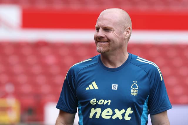
We like the Grok design, but we’re not sure the City Ground faithful will agree
It’s the season for going to a club shop that’s all decked out in tinsel, walking around the football kit mannequins and exclaiming ‘how much?!’, before buying it anyway for the significant people in your life.
And for your favourite Brexit voter, there is no better gift than a kit representing all that was great about football 10 years ago and supporting Mr ‘Utter Woke Nonsense’ Sean Dyche himself - a Nottingham Forest shirt. Helpfully the Garibaldis’ shirt this season is already one of the best in the Premier League and a highlight in Adidas’ already lush throwback range that also includes beautiful threads for Arsenal, Liverpool and the German national team.
It’s as much an instant classic as the 1992-94 kit it was based on, with the pinstripes and shielded crest proving a hit and the perfect look for Nottingham Forest’s return to European football after a 20-year hiatus. Interestingly though, more managers have already overseen teams in this kit than the original, despite it featuring for only a quarter of the time.
They say you can’t improve perfection, but we are going to see if Grok can, as we asked it to design a new kit for Nottingham Forest shirt…
Nottingham Forest 2026/27 home kit predicted by AI
We’re not sure if it is an upgrade on Forest’s current kit, but this could still easily be in the top 10 Premier League shirt designs this season. It’s certainly different, as this would be the clubs’ least red shirt ever - instead making way to a more balanced colour palette. Come to think of it, this would be a fantastic Bologna shirt actually…
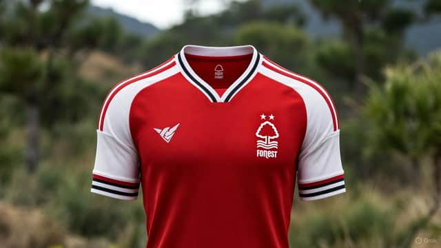
Groks says “The white shoulders are a direct homage to the famous 1977–1982 Umbro kits worn during the back-to-back European successes,” but it’s seemingly a bit confused given didn’t start making Forest’s shirts until the mid-1980s. And the design does indeed slightly echo the club’s 1986-88 shirt, which had a white band from the armpit to the top of the shoulder, but only very vaguely.
Yet disregard the dodgy provenance and we think it’s a classy touch, though we are aware that some City Ground faithful won’t agree with the break from tradition.
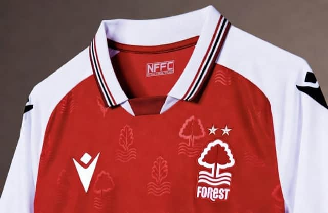
Hopefully you’ll be more on board with the detailing in the red of the shirt, which Grok describes as a “Very faint tonal watermark across the red body: a repeating Sherwood oak leaf and wave motif (representing the River Trent). Only visible up close or in certain light – keeps the shirt classy rather than busy.”
Nottinghamshire teams are probably second only to Inverness Caledonian Thistle in the amount of famous British mythology they can draw upon, and given they’re already named after a recreation ground that was once part of Sherwood Forest then it makes sense to lean into that opportunity.
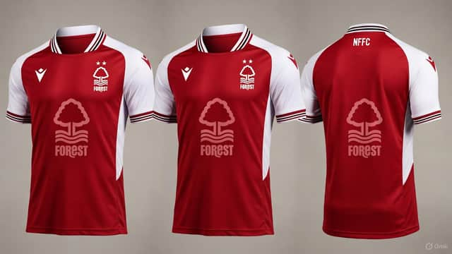
So while we’re not sure this is an improvement on the shirt that could down as the most iconic of the 21st century, we still love the design and would be intrigued to see it in domestic and European action. Forest fans, do you agree?