
We asked AI to design the new 2026/27 Everton home kit - and it gave the most basic design ever

It’s not hard to mess up an Everton kit, but we think Grok managed it
It is the time of year for fans to get excited about receiving a new football shirt for Christmas, and with Everton’s return to form under David Moyes after the dark days of Sean Dyche, Frank Lampard and Rafa Benitez, Toffees supporters will hope that investing in a football shirt this year can finally provide some long-term return in pride

While Everton have had some rather eccentric away and third kits in recent years and beyond, but the home design has remained fairly standard, and this year is no exception with wavy hoops in lighter and darker shades the only major design feature on the shirt that is almost all blue.
It copped some flak online like every club announcement these days but as is the case with most shirts, if Everton do go on to win silverware or qualify for Europe in 2026 then it will become iconic and otherwise it will soon fade from memory. Indeed, it is pretty hard to mess up a royal blue Everton kit especially these days, a fact that makes it even more impressive that Grok managed to do so when we asked it to design the club’s 2026/27 shirt.
Grok-designed monstrosity would be an Everton embarrassment
Grok claims this shirt is “A modern celebration of Everton’s royal-blue heritage with subtle nods to the club’s Victorian origins and the iconic Prince Rupert’s Tower,” and in fairness it was never going to call its own work “an absolute monstrosity”, which is what it is.

The issue is two-fold - the fact the shirt only has one major design feature, and the fact that design feature is terrible. Grok defends the white-out shoulders as “Direct homage to the famous 1960s–80s kits and the white-and-blue contrast that is part of Everton’s DNA,” but it seems to have specifically taken inspiration from the Toffees’ 1985-86 design.
They enjoyed enough success on the field that season, winning the Community Shield and finishing as runners-up in both the league and FA Cup thanks in large part to Gary Lineker’s metronomic scoring.
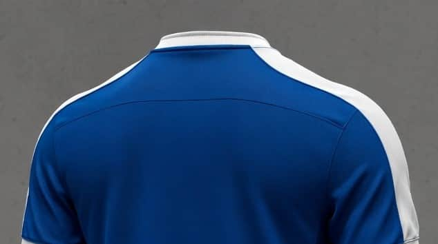
However, the only time they have ventured to a shirt as white as this concept in the 21st century, it was the 2000-2002 kit that was arguably Everton’s worst of the Premier League era. Though it coincided with David Moyes’ arrival on Merseyside and the conclusion of the Walter Smith era, the white panels on the side and the line running down the sleeve gave a boxy look and showed Everton’s shade of royal blue doesn’t work well with too much white.
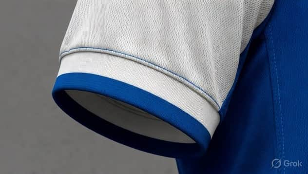
If the white shoulders had some detailing then that would be an improvement, or indeed if the rest of the design have any more intricacies rather than a plain blue sea. Yet the top is as basic as they come yet still manages to be an eyesore. As a training top this would be pretty bad but to have this as the symbol of the club for 12 months would be an embarrassment to The Toffees.