
We asked AI to design the new 2026/27 Manchester United home kit - and it's a missed opportunity

Man United home kits for the last decade haven't been memorable we found out if Grok could change that
In a country where seven clubs in the top four tiers won silverware last season and 14 Premier League clubs teams finished above trophyless Manchester United, The Red Devils almost certainly still win Christmas morning in the UK.
The pulling power of that red crest is still unmatched by all on these shores except maybe the liver bird and allowed Manchester United to beat their rivals to some of the players whose names adorn the shirts that are ripped out of their packaging on Christmas Day.
Bryan Mbeumo, Matheus Cunha and Benjamin Sesko all picked Old Trafford over more unified clubs that are competing in Europe this season, and in all the noise that surrounds The Red Devils, their kits sometimes go under the radar.
So many fans are going to buy the home shirt regardless of how it looks that it doesn’t matter if they’re good, like their underrated 2019/20 home shirt, bad - see their home kit the previous season - or as ugly as the controversial 2009/10 ‘black V’ design.
So given it’s basically a free hit, we decided to turn our hand to the matter. Or more accurately, ask the artificial intelligence Grok to turn whatever it uses for hands to designing a new shirt.
Grok somehow misses the mark with Man United shirt design
This has all the ingredients of an instant classic, but like in some of Grok’s other attempts, it just doesn’t quite come off when added all together. A big part of that is probably the shoulders - Manchester United have a spotty record when it comes to incorporating black styling into their designs and this is another example of that.
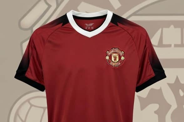
Grok describes the design choice as: “Black raglan shoulders fading into solid red sleeves, finished with thin white-black-white cuff trim. The black-to-red fade is a modern twist on the famous 1990–92 “snowflake” away shirt shoulder detail, but used sparingly.”
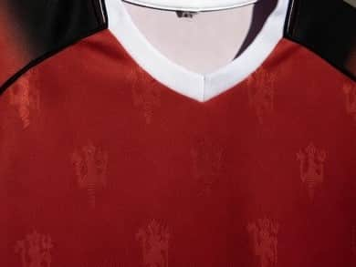
We have no idea how this echos that iconic away kit, but whatever the reasoning, it doesn’t create the effect they were after. That’s not the case with the Red Devil figures hidden in the main body of the shirt.
“Very faint tonal watermark across the red body: repeating micro trident pitchforks and “1878” numerals. Only visible up close – keeps it classy, not cluttered,” is Grok’s description, and it gets this one spot on.
The only thing we’re not 100% sure about is it would work on the pitch but we’ve chosen to be optimistic, and it certainly looks good in the renders. But it’s easy to imagine this detailing looking immaculate in everyday life, on someone in a pub beer garden, in the Old Trafford stands, or on a kid wearing it to their school’s non uniform day.
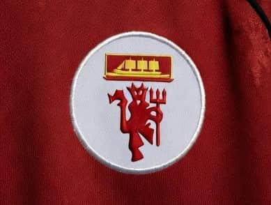
Clear up the sleeves then, and this could be an iconic kit especially if Manchester United could turn the season around. Another thing Grok definitely nailed was a new yet vintage concept badge that looked incredible, featuring just the Red Devil icon and the ship that represents the Manchester Ship Canal and the city’s industrial peak.