
We asked AI to design the new 2026/27 Newcastle home kit - and it won't turn heads

With Eddie Howe’s club in need of revenue, this shirt doesn’t look like a bestseller
Newcastle United have arguably the hardest shirt design theme to mess up in world football - as long as you can look past their current kit seemingly being a billboard for the Saudi Arabian regime - with those iconic stripes never looking too bad whether in relegation or the Champions League.
Indeed, The Magpies’ only major wardrobe malfunctions aside from sponsors (yes, plural - looking at you Wonga) have come when they’ve tried to venture beyond their traditional colours on their alternate kits. Case in point - that widely derided ‘custard and cream’ 2008/09 away kit.
But for at least the whole Premier League era bar a couple of seasons like 2014/15 (which also featured a truly horrendous lime green and navy blue third shirt), Newcastle have flown the flag for classy home kits in the first and second tiers of English football.
We’ve done several of these and for good, bad, ugly or risque, the results are usually out there. However, that wasn’t the case with Newcastle, as you can see… It’s no secret that football designers can be notoriously unimaginative some years, and there are only so many ways to style black-and-white stripes, but even so we feel some homework copying has occurred.
AI-designed basic Newcastle United shirt unlikely to turn heads
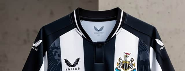
Named the ‘Magpie Legacy 2026’ shirt, at first glance it’s impossible to see anything about the design that’s more ‘Magpie’ or ‘legacy’ about this particular concept than any other Newcastle shirt.
It’s not blue, like The Magpies’ first shirt, it has fewer and fatter stripes than the iconic ‘Newcastle Brown Ale’ strips. And while it has the same number of three black and two white stripes on the front as the club’s first black-and-white shirt in their maiden season named Newcastle United, that was the same design as the penultimate kit sponsored by the infamous (and now defunct) payday loan company Wonga.
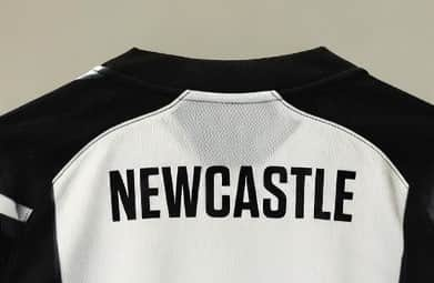
The principle detailing is the detailing on the stripes, described by Grok as: “Very faint embossed magpie silhouettes and St James’ Park gable outlines within the white stripes. Only visible up close or when light hits – adds depth without ruining the classic look.”
We’ll take Grok’s word for it, because we really can’t make out what those graphics are meant to be but they look something like a comet, or those ‘explosive’ warning symbols you learn in GCSE chemistry.
Other than that, the design is phenomenally similar to the current Newcastle United shirt which does raise the question of whether that is worth an investment of almost £100, as the shirt is currently priced. And Grok either forgot Newcastle’s shirts are produced by Adidas, or is in the pocked of Nike and Castore as it produced mock-ups of the shirt with those two logos rather than The Magpies’ official kit suppliers.
Still, at least it didn’t copy the Saudi Arabian national team’s shirt design and call it a day. Again. So it could be worse…