
We asked AI to design a new Rangers kit for 2026/27 - the results were bizarre

Could AI be the future of kit design? We got it to come up with a new Rangers shirt to find out.
As we enter the festive period, football fans across Scotland are likely to find themselves unwrapping replica shirts over the coming days – and plenty of Rangers supporters will head to matches in the new year clad in some nice fresh blue kit. All very lovely and seasonal, but we couldn’t help but wonder… Could those kits be just a little bit more interesting?

We’re sufficiently bored while we wait to lay into some turkey that we got to wondering whether the age of AI we seem to have stumbled into might also have an impact on kit design – so we asked a well-known generative AI programme to put together a brand new Rangers shirt to see if it might come up with something a little spicier that can go under Glaswegian trees next year. And the result was… certainly different.
AI designs a brand new Rangers kit with bizarre results
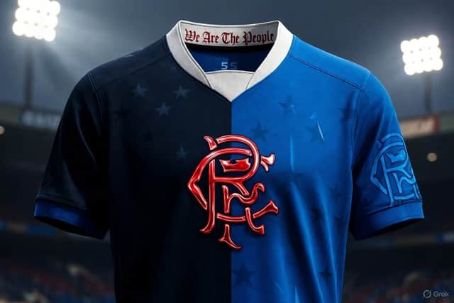
Prompted to come up with a brand new Rangers shirt with some original design elements, whatever passes for the imagination of an algorithm certainly ran riot – as you can see from the image above.
Breaking with tradition just about as firmly as it reasonably could, the AI decided that Umbro could do with moving away from the classical blue shirt and stray into two-tone territory with blue and black halves – with the Rangers club crest taking pride of place right across the chest in bright red.
Across both halves of the shirt, 55 stars (one for each of the club’s Scottish Premiership titles) would be printed, in the shape of the constellation Leo to mirror Rangers’ lion emblem. Snazzy.
Rangers’ shirt sponsors probably wouldn’t be too keen on the layout, but ignoring such qualms it’s certainly a striking design with a rather sharp white collar with the ‘we are the people’ motto stitched into the nape of the neck. It may not be one for the purists, but could AI actually be on to something here? Should Umbro be taking some notes as they get ready to launch next season’s kit?
Well… Perhaps not. Because while the basic design of the shirt is actually pretty sharp for an algorithm which can only have fashion sense if it copied it from someone else, it’s eye for detail may lack any real grasp of reality…
The bizarre detail which makes this AI Rangers kit unlikely to appear on shelves
You see, that gigantic red club crest isn’t just any old crest. That would be too simple. It’s actually printed in – and we quote – “temperature-reactive chromatic ink,” which may or may not be a real thing, and reacts to the body heat of the person wearing it.
At room temperature, the crest is apparently an “almost invisible” matte grey colour – only becoming a metallic red when exposed to body heat or “is under the Ibrox floodlights.” Then, it “literally wakes up” (somebody needs to feed the AI a dictionary with the correct definition of literally, apparently), and becomes the bold design we see on the kit above.
According to AI, it would be the “first use of thermochromic metallic ink in any Rangers kit” – no, really? – and, we suspect, would make this probably the most expensive shirt in the history of replica shirts. And that’s if thermochromic metallic ink actually exists in the first place, which we are yet to be entirely convinced of.
So perhaps AI does, depressingly, have a role in shirt design going forward, at least in terms of providing the kind of inspiration we no longer seem interested in asking actual human beings the offer us – but for now, at least, the practicalities are perhaps best left to actual human designers. Besides, put this shirt under the Christmas tree and maybe the fairy lights will make the crest glow through the wrapping paper. Can’t have the surprise being spoiled like that on Christmas Day now, can we?
READ MORE: The ten worst kits of the 2025/26 season