
We asked AI to design the new 2026/27 Tottenham kit - the result was a total failure

We asked AI to design a new Spurs kit for Thomas Frank’s stars like Mohammed Kudus and Cristian Romero to wear
Christmas is often a time for football fans to reaffirm their commitment to their beloved club by going on the festive fixtures and helping fund that superstar signing in January by asking Santa to bring them their latest shirt, but one wonders how keen Tottenham Hotspur supporters will be to advertise that fandom this year.

Their joint-worst defeat in the North London Derby since 1967 (they’ve only lost by a large deficit three times in their history, two of them coming before the construction of the Berlin Wall) followed Tottenham’s shocking 17th-place finish in the top flight - the club’s lowest ebb in the Premier League era and things haven’t really improved since then.
Despite a positive start to the season, when Spurs were only four minutes away from lifting their second trophy in 17 years and shocked Manchester City, but pressure on Thomas Frank’s dugout has only mounted since that cowardly trip to the Emirates. Tottenham’s shirt sales are also unlikely to be helped by a pretty bland kit design, so given we’re not really able to help with the tactical issues we decided to tackle that problem instead.
And when we say that, we mean we decided to ask Grok to tackle that problem, and this is what it produced…
Revealed: AI designs Spurs’ new kit for the 2026/27 season
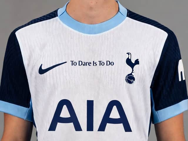
On paper (or pixels), a white, navy blue and cyan shirt sounds fantastic. They had great success with their alternate light blue designs in 2019/20 and 2024/25 and obviously the darker blue is a staple of the club. Grok says as much in its design notes:
“Crisp, bright white as the primary colour – the iconic "Lilywhite" foundation that Tottenham have used for the vast majority of their home kits since the club's early days. This keeps it instantly recognisable and true to tradition. Navy blue and light blue (aqua/cyan) – navy is Spurs' classic secondary colour, while the lighter blue adds a fresh, modern pop that fans have loved in recent successful kits.”
The issue is simply that - in our opinion at least - it just doesn’t come together into a classic kit and is much lesser than the sum of its parts. Notwithstanding that dreadfully placed and scaled ‘To Dare Is To Do’ mantra, which has no place slap bang in the middle of the torso, the similar colours appear to dilute each other rather than combining pop with class.
This isn’t the first time this season that Tottenham would’ve failed to make the most of a promising concept, mind. They’re somehow the only Premier League club to mess up a classic badge concept with their yellow monstrosity of a third kit completely botching what should’ve been a slam-dunk shirt.
Without wanting to get too into the styling analysis (I am a sports journalist after all, much more at home at the Parc des Princes than Paris Fashion Week), the tight flat collar also feels an odd choice. A dress shirt-style collar (I’m expecting a job offer from Vogue any minute) would work so much better, though maybe that would involve flipping the blues around. Yet either way, it’s far from the worst example of this kind of AI-designed kit…