
The five worst West Ham kits in the Premier League history - including 2022 howler
Counting down the five worst West Ham shirts of the Premier League era
West Ham were promoted back to the Premier League back in 2012 after beating Blackpool in the play-off final under the guidance of Sam Allardyce. Attacker Ricardo Vaz Te scored a dramatic late winner against the Tangerines at Wembley. The Hammers have since established themselves as a top flight football club.
They moved into the London Stadium back in 2016 and have even played in Europe since then. Graham Potter’s side finished in 14th place in the table last season and will be hoping for better this time around. Here is a look at their five worst kits from the top flight era....
5. 2023/24 Home Kit
West Ham’s 2023/24 home shirt was designed by Umbro, who remain their suppliers today. It was very claret-heavy though and didn’t feature much blue. They deviated too much away from their traditional claret and blue balance and it wasn’t the most appealing looking top.
It was an underwhelming kit that was pretty uninspiring. Many supporters wanted a bit more flair off the back of their 2023 Conference League win under David Moyes, who is now at Everton. They beat Fiorentina in the final to win the trophy with Jarrod Bowen scoring the winner to spark wild scenes among their supporters in the stadium.
4. 1995/96 Home Kit
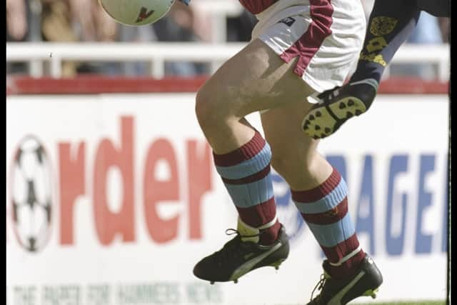
Rewinding back to 1995/96, West Ham sported a cricket style top. It was an oversized fit and had a very mid-90s aesthetic to it. It was badly dated and it’s very baggy style will have made it hard for players to wear at the time, especially during hot days/nights.
Pony created it and they were binned by the club shortly after. To make matters worse, it is associated with a poor 15th place finish in the table that year. It doesn’t live very long in the memory and was rightly left behind in the 90s.
3. 2021/22 Away Kit
West Ham were designed a white-based away strip by Umbro back in 2021/22. It included claret and blue accents but looked basic and lacklustre. It’s intention was to be bold but it lacked any real conviction and didn’t stand out.
It was a bit of a missed opportunity in this particular campaign. The Hammers were in Europe and should have worn a better kit in hindsight. It didn’t really stand out at all and was way too simple. They finished in a respectable 7th place in the league that year and Bowen managed to find the net on 18 occasions altogether.
2. 2020/21 Home Kit
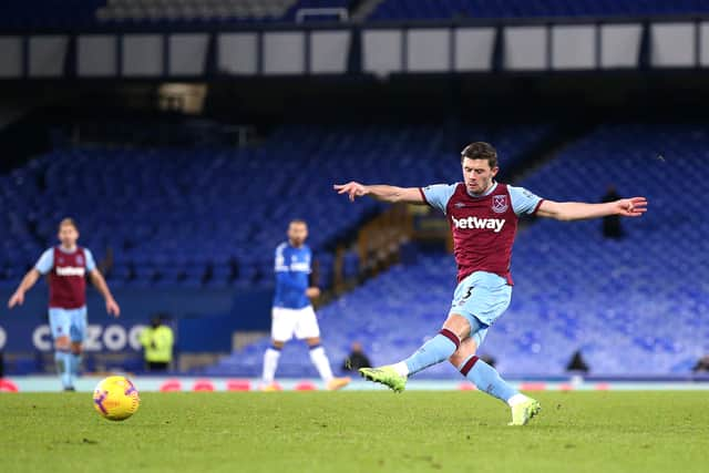
Umbro didn’t do West Ham many favours in 2020/21 either with a recycled version of previous kits. Although it is hard to think of new ideas, it had no standout features whatsoever. It had a lack of creativity and minimal changes were made.
They played behind-closed-doors during this campaign and despite the shirt being forgettable, the team actually performed well on the pitch. Despite having no fans in the stadium, they worked well under Moyes. They picked up a club record 65 points and ended up in 6th position which was enough for European qualification.
1. 2025/26 Home Kit
West Ham haven’t made many tweaks at all for this current season. Umbro have gone for a predominantly claret strip again with minimal blue on their sleeves and collar. It looks bang average and is unlikely to fly off the shelves.
It is too generic and the drastic reduction of blue makes it look tacky. In addition, the Boyle Sports sponsor logo is too big and ruins it. It is a downgrade as Potter’s men look to compete higher up the table if they can. Potter has struggled for results so far and may start to feel the pressure soon if things don’t see an upturn.