
The 10 best kits of the 2026 World Cup: France & Spain among the most stylish sides

Ranking the best new kits from the 2026 World Cup - with France, Germany and Spain all making a stylish splash.
In just a fortnight’s time, Mexico and South Africa will get the 2026 World Cup underway with a repeat of the opening match of the 2010 edition of football’s greatest tournament – and what is also set to be one of football’s greatest fashion events. The 48 teams involved are bringing some particularly beautiful kits with them this time around.
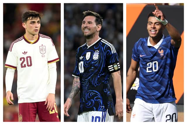

With so many superb shirts on display this summer, we’ve decided to rank our 10 favourite designs, from the clean and traditional to the bright and bold, with a throwback to a past classic thrown in for good measure. However good the football proves to be (and however many spectators actually show up to watch it) at least this World Cup should be pretty easy on the eye...
10. Netherlands (away)
The Dutch home kit is, of course, the classic slab of bright orange with a touch of black trim, but we’ve got to give Nike credit for the way they’ve handled the change strip this year – the graded band of orange running along the chest with the centred crest and the chevrons looks fantastic. We’re a sucker for a nice, clean white shirt with a pop of colour at the best of times, and this is a wonderful example of the genre.
9. Saudi Arabia (home)
Another strong entry from Adidas, and surely the best Saudi Arabia shirt of all time – admittedly, not a high bar to clear unless you’re really keen on plain green tops. The geometric pattern is apparently inspired by traditional Saudi architecture, but it’s the flashes of lilac and the gorgeous two-tone collar which really pull this all together.
8. Ivory Coast (away)
We’re prepared to admit that there’s a fail case here, and every chance that Puma’s daring and lively green and orange design doesn’t look quite as good in action as it does in a still photo when you can appreciate all of the detail. But until proven otherwise, we’re giving this the benefit of the doubt and trying to find out where we can get one for ourselves – the swirling combination of sunbursts and palm trees could so easily have wound up being an over-busy eyesore, but the pastel colours ensure that it all comes together rather gracefully. At the very worst, this would make for some first-rate wallpaper.
7. Spain (away)
We may like a nice clean white kit, but a clean cream kit is even better – and any kit which has a hint of a classic Roma away jersey gets our vote. Adidas’ design here is simple, elegant, and features perhaps the best collar and sleeve trim combo of any shirt being worn in the tournament. There are far more creative jerseys on this list, but none that are quite as elegant.
6. Mexico (home)
We’ll see this one in the very first match of the tournament and it should set the tone very nicely indeed. The design is apparently based on an Aztec solar calendar and looks absolutely fantastic, with the red and white trim setting providing a nice touch. It helps that Mexico probably have the best badge of any nation in the tournament. This isn’t the first time that they’ve gone down the two-tone green with an Aztec design route (check out their memorable 1998 effort) but it might be the best.
5. Ghana (home)
Puma are doing most African countries’ kits this year and they’ve come up with some extremely vivid designs, but while we’re worried about being blinded by the neon Magic Eye goalkeeper kits they’ve cruelly forcing the tournament’s shot-stoppers to wear, we do love their work for Ghana – a truly unique jersey with a spiderweb pattern inspired by the folk character Anansi, a trickster often depicted as a spider. A combination of beautiful design and a nod to cultural tradition makes this a big hit.
4. Argentina (away)
This gorgeous shirt has been out for a couple of months already but it hasn’t grown stale in the slightest. The swirling blue floral pattern is truly spectacular and the understated collar is another example of Adidas’ knack for getting the fine details right. Argentina’s stunning pre-match shirt deserves a shout-out too, and we suspect that it’ll disappear from shelves rather swiftly.
3. Belgium (away)
This has a fair chance of being the football hipster’s favourite this year, and we wouldn’t blame them for being keen: The intricate, post-modern pattern of pink and blue spheres, loosely inspired by Brussels landmark The Atomium, is beautifully set off by the thick black trim, and a design which could have been garish ends up looking absolutely sublime instead. Adidas have knocked it out of the park this year.
2. Germany (home)
Guess what? More Adidas. They’ve gone retro for their home country this time out, with the sharp black, red and gold design harking back to the legendary German jerseys of the early 1990s. Given that they have always been the country’s most iconic kits, we’re surprised it’s taken more than 30 years for Adidas to go back there again – but the wait was evidently worth it.
1. France (home)
For all that we’ve praised Adidas’ work to the rafters, it’s Nike who take our top spot with their stunning design for France: The zig-zag pattern could have looked like a bus seat if they weren’t careful, but instead it looks classical, especially when set off by the crisp white collar which, crucially, is button-up. That button alone might be the best decision Nike have made all year. A great kit, which graciously straddles the line between traditionalism and modernism and, if you’ll forgive the grimly inevitable cliché, has a certain je ne sais quoi about it.