
The 10 worst kits of the 2026 World Cup - including American & Swiss crimes

We rank the 10 worst shirts on display at the 2026 World Cup - starring the United States, Australia and Switzerland.
As we noted in a recent list of the 10 best new kits for the 2026 World Cup, this year’s tournament will be a particularly fashionable one, with a number of stunning shirts on display – but while plenty of the teams will be positively dripping with style this summer, there are a few sides who are set to bring the tone down somewhat.
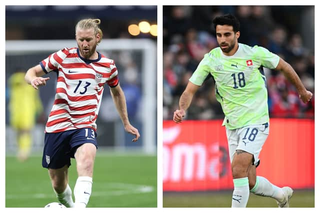

Today, we’ve decided to take a look at the 10 most heinous crimes against football kits set to be committed across the coming month, from the eye-gouging to the drearily dull. These are the shirts that will be left on the discount racks come the autumn.
10. Jordan (home)
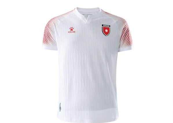
World Cup debutants Jordan have made a pretty major mistake – they’ve forgotten to bring football kits. Rookie error. It’s not that we mind the mottled red sleeves too much, and this is a shirt that would draw little comment if it was worn by a field hockey team, perhaps, or the Chinese Olympic table tennis squad, but it simply isn’t a football shirt. Kelme did a perfectly respectable job with their Bosnia & Herzegovina shirts, but it looks like they ran out of time to sort Jordan out and had to grab something from Sports Direct’s lawn bowls section.
9. Croatia (home)
This is a crime that Nike commit with alarming regularity these days – trying to get clever with a classic design and spoiling it in the process. Croatia’s traditional red and white checked tops simply shouldn’t be messed with, but the thick white band running down the centre of the shirt (which we cynically suspect exists primarily to make it easier to see the swoosh) spoils what is normally a pretty damned near perfect design. Just leave it alone.
8. New Zealand (home)
Puma seem to have put so much effort into their jazzy designs for the various African teams they’re working with that they simply couldn’t be bothered to come up with anything funky for the Kiwis. There’s a half-hearted effort at a graphic pattern here, but it’s so faint that the kit just ends up looking like the kind of off-the-shelf training top a local Power League team might end up wearing. This needed decent detailing work to look good, and simply didn’t get any. The away version isn’t much better.
7. United States (home)
A confession: We think there is an outside chance that this kit might actually look good in action, but in still photographs we simply aren’t convinced. Perhaps it’s just because the sheer rootin’-tootin’, Bald Eagle-wielding Americanness of plastering the flag across their players’ chests is all a bit too much for us in the current climate, but this is simply far too “U-S-A! U-S-A!” for our tastes. It looks like Kid Rock sounds.
6. Paraguay (home)
Another Puma misfire here, and it’s not the first recent kit to teach the world’s kit manufacturers a lesson they seemingly refuse to learn: Stop trying to get fancy with stripes. It never, ever works. The speckled, blurry, pink-adjacent stripes with the badly-matching blue trim just end up making Paraguay’s players look like a packet of Tesco Value crab sticks. Pretty horrible.
5. Egypt (home)
Puma yet again. Egypt definitely drew the short straw with Puma’s numerous African shirt designs – both Ghana and the Ivory Coast had entries in our 10 best kits – for the simple reason that the graphic design has a strong whiff of AI about it. Whether that’s the case or not, we honestly don’t know, but we could absolutely believe that the pyramids jutting out at all angles, with a couple of ankhs tossed in seemingly at random, was the result of a stereotype-heavy prompt fed into an algorithm rather than something that was carefully thought through by a professional designer.
4. Australia (away)
Much like Kelme’s Jordan kit, this Nike effort for the Aussies manages to look like it belongs in a completely different sport. Unlike Kelme’s Jordan kit, this doubles down on that error by having an absolutely disgusting design as well. Someone, somewhere, genuinely thought that a teal body which suddenly lurches into coral pink north of a player’s nipples was a nice idea. Never let that person do any interior decorating, please.
3. Iran (home)
The Iranian squad are already having to deal with a hell of a lot right now. As if their country getting bombed by one of the tournament’s hosts wasn’t quite enough, they now have to take to the field wearing a shirt that’s been ruined by the addition of a bizarrely incongruous cheetah head poking around the corner of the torso. It looks like something the designer’s grandmother thought looked sweet. The faint cheetah print on the sleeves doesn’t help, either. Rubbish.
2. Paraguay (away)
The mercy for most teams on this list is that they might at least get to play a match or two in their other shirt. No such luck for Paraguay. When they aren’t dressed as crab sticks, they get to do an impression of the aftermath of the Exxon Valdez disaster instead. Perhaps the decision to go with an oil-slick design was a disguised protest at the grotesquely large carbon footprint of the expanded World Cup? More likely someone at Puma just really has it in for Paraguay. Maybe Roque Santa Cruz once stole their parking space.
1. Switzerland (away)
This isn’t so much a football kit as an unwarranted assault on the eyes of anybody who shows up to watch a Switzerland match. This is a shirt that actually makes us glad that ticket sales have been poor, because nobody deserves to pay hundreds of dollars to go to a game and have their retinas seared off. There has been a sum total of zero palatable lime green jerseys in the history of football, and this won’t change that statistic. Maybe the graphic design is actually quite nice in some way, but we simply can’t tell as the sheer viciousness of the hue makes it impossible to look closely enough. Oh, and apparently it glows in the dark. At least they won’t get lost on the way home.
Puma are responsible for half of the shirts on our list, but this is worse than all of the others combined. Still, it’s not quite as bad as Manchester City’s third kit for the last year, so there’s that. Oh, wait, that was Puma too. We need to make them stop.